Federal Flood Maps Versus New Flood Mapping Reports
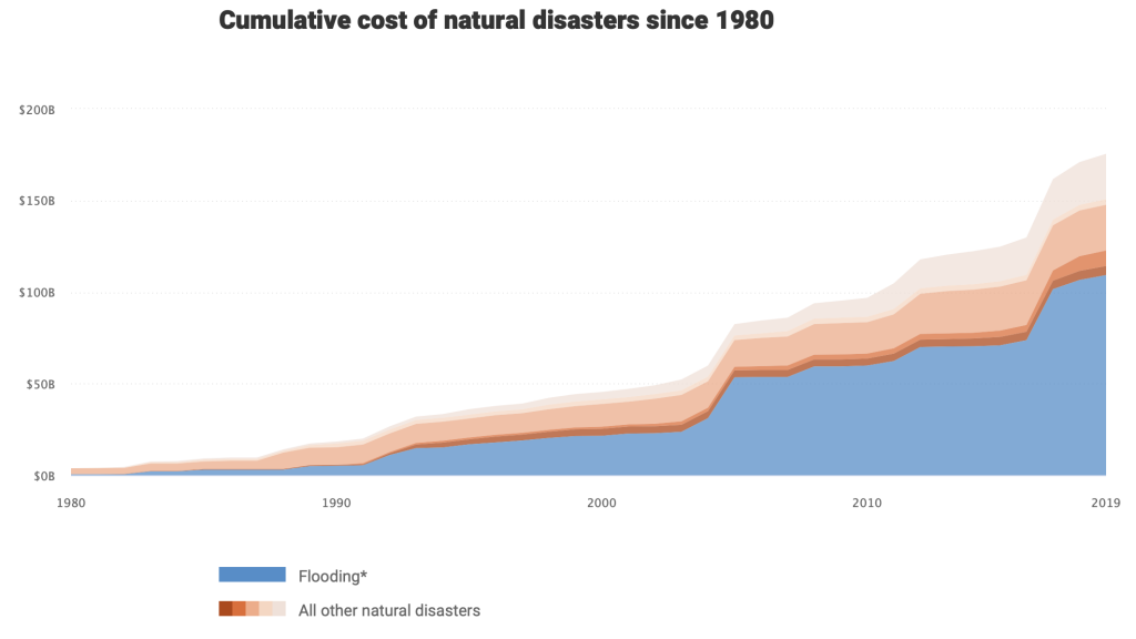
According to new calculations, the flood risk across many states in the country is far greater than current government estimates show. This threat could grow as climate change gets worse.
First Street Foundation, a group of academics and experts that are based in New York City compiled the data and created a website where people can check their own address in regard to flooding risk levels. The groups calculations take sea-level rise, rainfall and flooding along smaller creeks that are not mapped federally into consideration when calculating flood danger.
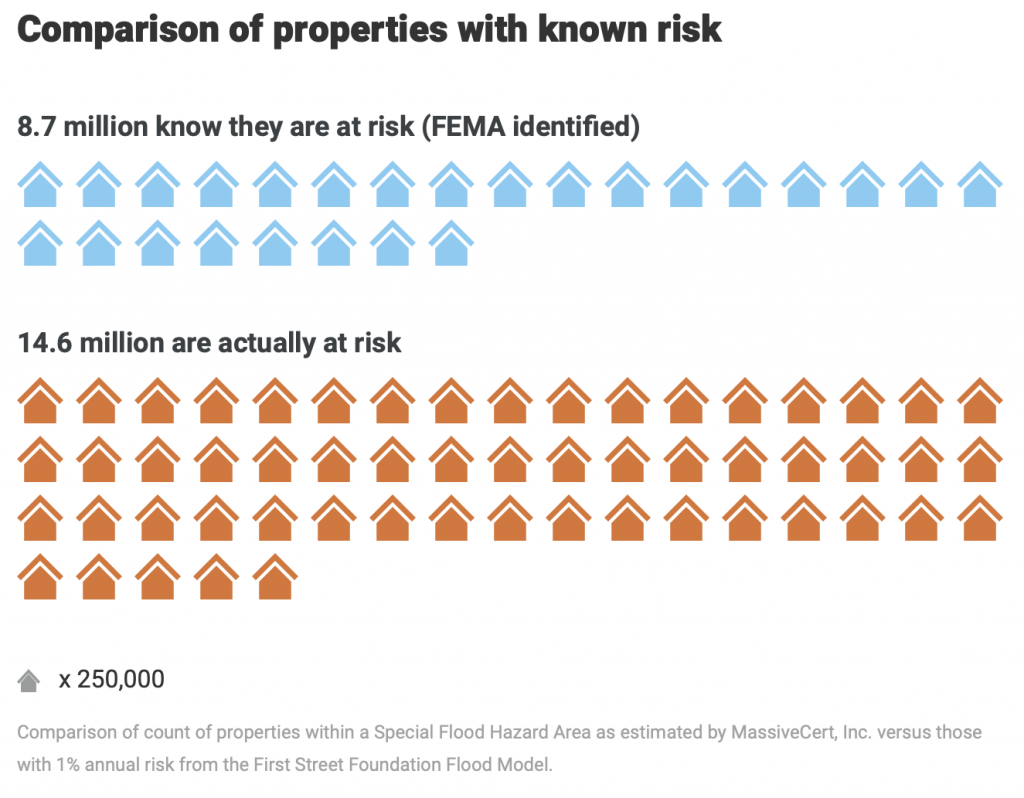
The findings were pretty dire with at least 14.6 million properties at risk from a 100-year flood. This is a dramatic increase over the 8.7 million properties shown on federal government flood maps. A 100-year flood is one with a 1% chance of striking in any given year.
Federal flood maps are used to guide homeowners where and how to build in specific areas as well as whether homeowners should (or must) buy flood insurance. It also helps mortgage lenders decide how much risk to take on particular properties.
There were huge differences between the data compiled by First Street Foundation when compared to government numbers. Cities such as Fort Lauderdale, Florida; Buffalo, New York, and Chattanooga, Tennessee saw wide variances in the numbers. In Chicago there were a whopping 75,000 properties where the flood risk changed. The numbers also showed that minority communities often face a bigger share of hidden risk.
“Millions of home and property owners have had no way of knowing the significant risk they face,” said Matthew Eby, founder and executive director of the First Street Foundation in a recent Sun Sentinel article.
There have long been concerns that maps drawn by the Federal Emergency Management Agency underestimate the risk of flooding in particular areas. Keeping the maps up to date can be labor intensive as well as expensive and as climate change worsens the danger keeping up has become even more difficult.
Whenever FEMA does issue updated flood maps they are often challenged by both local politicians and homeowners who object because they hope to avoid paying higher flood insurance rates. “You can’t appeal your rate. You can only fight your map,” said Roy Wright, who ran the National Flood Insurance Program until 2018 in the Sun Sentinel article. “It turns it into house-by-house combat.”
First Street Foundation calls is model Flood Factor and it uses federal elevation and rainfall data, as well as coastal flooding estimates from hurricanes. They also incorporated data from the national database of flood claims and historic flood paths.
The results cover the contiguous United States, even in areas where the federal government hasn’t done flood mapping or the current government maps are decades old. The results show that there is a vast risk increase in many areas, including inland areas, particularly major cities.
There are exceptions, areas where they find the flood risk to be less than what federal flood maps show. This is particularly true around the Mississippi River and the Gulf Coast. First Street said that in some small municipalities, their model may overestimate flood risk, mainly because it doesn’t capture every local flood-protection measure, such as pumps or catchment basins.
FEMA feels that First Street’s initiative will “complement FEMA’s efforts. ”“We know there is no perfect science to predict flooding,” a spokeswoman said in the Sun Sentinel article. “The Flood Factor product may help property owners with the critical decisions they must make and purchase necessary insurance.”
Inland Cities May Be More at Risk
According the data from First Street, there are numerous cities that have tens of thousands of properties that are at risk of flooding that are not shown on government maps. Chicago in particular is more vulnerable than previous thought.
FEMA’s found that just 0.3% of Chicago’s more than 600,000 properties inside the 100-year flood zone. However, First Street shows that almost 13% of city properties face the risk of a 100-year flood which is roughly 75,000 more properties than FEMA’s maps show.
The finding that almost 13% of Chicago properties are at risk from rain-based flooding “would not surprise me one bit,” said Kevin Fitzpatrick, who supervises sewer infrastructure for the water district in the Sun Sentinel article.
The increased risk is hitting minority communities harder than others the data shows. In Chicago, the city of Englewood, on the South Side, where almost 95% of residents are African American, FEMA maps show zero properties fall in a 100-year floodplain while data from First Street finds almost a third of properties fall into this category.
In fact, in over two-thirds of states, First Street discovered that areas with more minority residents also had a greater share of unmapped flood risk.
This increased risk in communities of color matches other data in Chicago. According to
Marcella Bondie Keenan, program director for climate planning at the Center for Neighborhood Technology, roughly 87% of insurance claims for Chicago flood damage between 2007 and 2016 went to people in communities of color.
The Appalachia area also faces greater risk than what FEMA maps show. In Chattanooga and Charleston, West Virginia, FEMA data shows that less that 10 percent of properties are in a floodplain. First Street data on the other hand shows that over one-third of properties in this area fall into a floodplain.
Due to the fact that that revised flood maps can result in dramatic flood insurance premiums, flood maps often end up causing political fights. A good example is the city of Buffalo. FEMA officials proposed updating maps in Buffalo last year which resulted in both residents and city council members objecting to the new ratings.
FEMA found that only 0.4 percent of properties in Buffalo were at risk while First Street found 17.5 percent were at risk. Buffalo was heavily flooded in both 2014 and 2019.
Coastal Areas Also at Risk
Coastal areas are also at increased risk of flooding according to First Street data. Fort Lauderdale is a good example, with FEMA putting about 41 percent of the city in a flood zone while First Street thinks almost two thirds of the city is at risk. This is an increase of 13,000 properties.
“It seems plausible,” said Richard Benton, Fort Lauderdale’s floodplain manager in the Sun Sentinel article. He said the maps did accurately show areas that typically flood despite being outside FEMA’s flood maps.
Much like Chicago, the increased risk found by First Street tends to be in minority communities. In a zip code on the western side of Fort Lauderdale, First Street’s data finds that’s 42 percent of properties are in a floodplain while FEMA finds just 6.5 percent fall into that category. In this zip code, 80 percent of the residents are African American.